
The save the date is your gala's first impression — and your first ask. Months before tickets go live or a single sponsor signs on, it's the small, beautiful thing that lands in an inbox and says: hold this night for us.
Most organizations treat it as a formality. The best ones treat it as a design brief. Below are ten 2026 save the dates that get it right — and what each one does that you can borrow.
1. American Institute for Stuttering — 30th Annual Gala
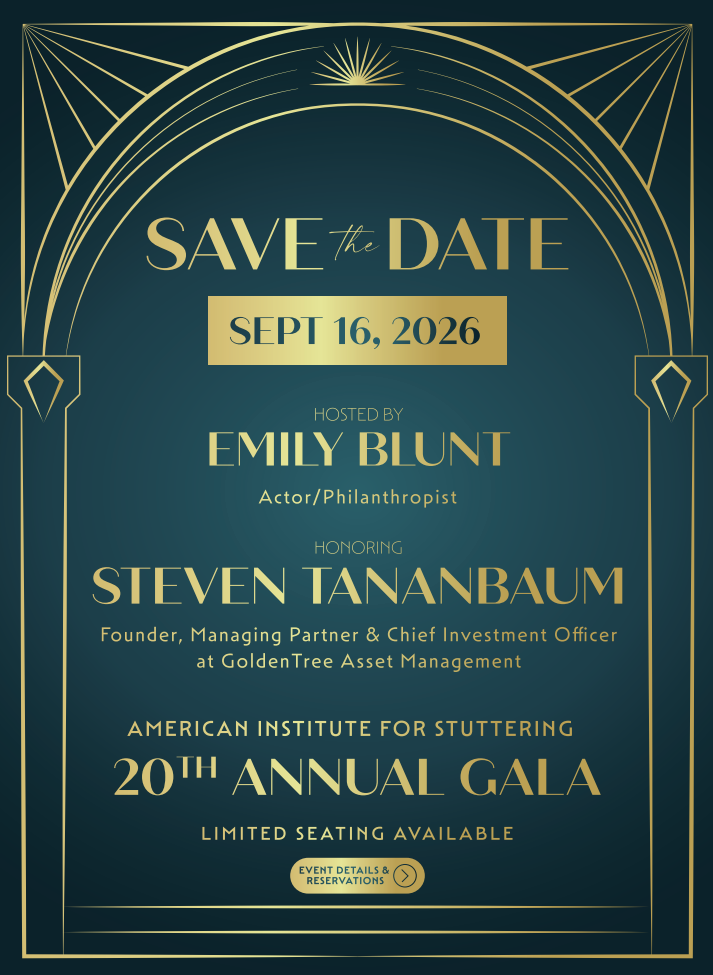
A gilded Art Deco arch on deep teal, with a sunburst cresting the top and "SAVE the DATE" set in tall gold capitals. The date sits in a foil-block bar you can't miss. Everything below it — host Emily Blunt, honoree Steven Tananbaum of GoldenTree Asset Management — descends in a clean hierarchy.
Takeaway: the date gets its own container. Framing it in a solid block pulls the eye there first, no matter how much else the card has to carry.
https://www.stutteringtreatment.org/
2. Breaking Ground — Celebrating Home & Community Gala
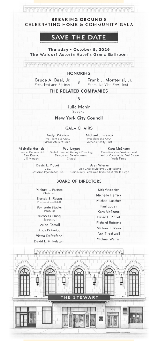
An architectural line drawing of The Stewart anchors the bottom of an otherwise black-and-white broadside. Above it: honorees, gala chairs, and the full board, set in a tapering column like a playbill.
This is the honor-roll save the date — the design admits up front that its job is to name people, and it names a lot of them. The building illustration keeps it from reading like a directory, and quietly says this is what your night pays for.
Takeaway: if you have to list forty names, don't fight it. Give the list a rhythm and let one image do the emotional work.
https://www.breakingground.org
3. El Museo del Barrio — Gala 2026
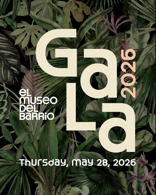
Enormous cream letterforms spelling GALA, interlocked and stacked at different scales, laid over a dense jungle of dark tropical foliage. The year climbs the right edge in blush. It looks like an exhibition poster, because that's exactly the point.
Takeaway: type as the image. When the word itself is the graphic, you don't need a second focal point — and a museum audience will read the confidence instantly.
4. New Yorkers for Children — 30th Anniversary Gala
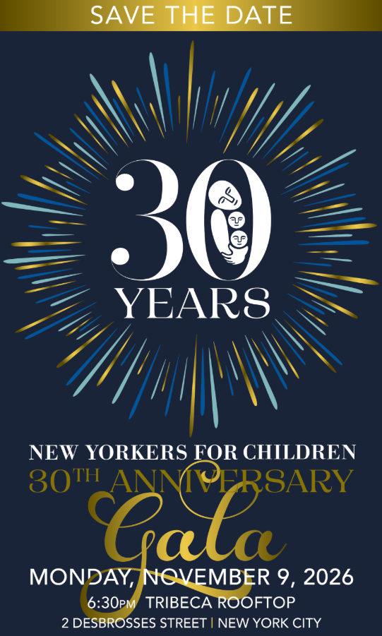
A radiating starburst of navy, gold, and seafoam spokes explodes outward from a towering "30 YEARS" — with the NYFC mark tucked neatly inside the zero. Below, the script "Gala" and the full logistics: Monday, November 9, Tribeca Rooftop.
Takeaway: the milestone is the hook. If you're hitting a round anniversary, make the number the largest thing on the card and let it carry the invitation.
https://www.newyorkersforchildren.org/
5. New Mexico Fight For Life — Masquerade Gala Ball
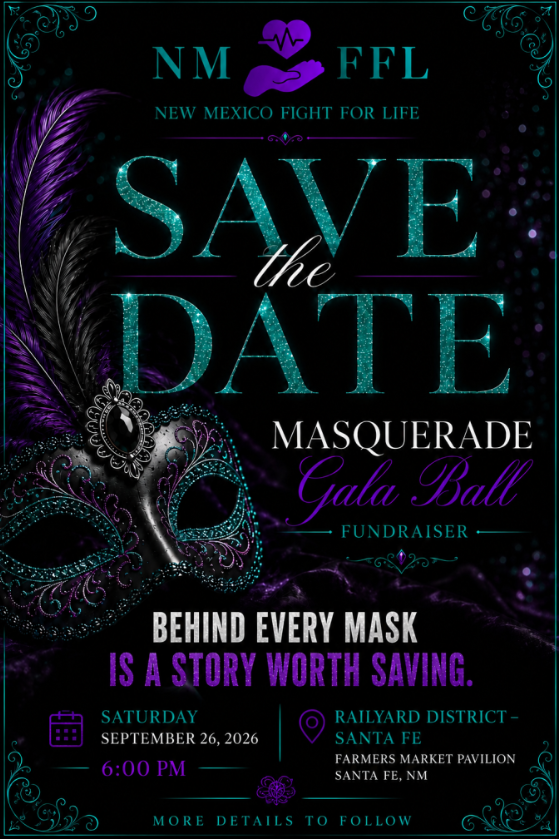
Teal glitter type, a feathered masquerade mask in purple and black, and a line that does more than decorate: Behind every mask is a story worth saving. Date, time, and venue drop into tidy icon-led rows at the base.
Takeaway: the tagline. One sentence ties the theme to the mission so the masquerade isn't just a costume — it's an argument. If your gala has a theme, make the theme mean something.
https://newmexicofightforlife.com/
6. Nuestros Niños Day Care Center — Wonder in Motion
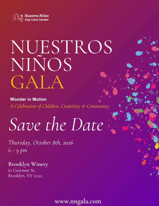
A red-to-purple gradient with a burst of paint splatter flung across the right side. Elegant serif capitals for the name, italic script for the ask. The subtitle — A Celebration of Children, Creativity & Community — tells you the splatter isn't decoration, it's the program.
Takeaway: the gradient does the heavy lifting a photo would, at a fraction of the production cost. For organizations without a big design budget, color plus one gesture goes a long way.
7. The New York Foundling — Fall Fête
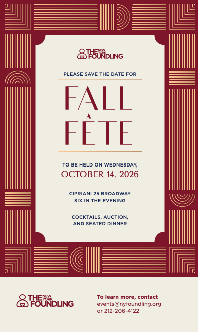
Deep burgundy with gold Deco linework built into a full border, framing a cream panel shaped like a ticket. "FALL FÊTE" sits in tall condensed serif capitals with hairline rules above and below. The footer carries the contact details on its own cream band.
Takeaway: the ticket-shaped panel. It's a subtle visual promise — this is your entry — and it separates the ornament from the information so neither has to compete.
8. New York Immigration Coalition — This Is Our New York
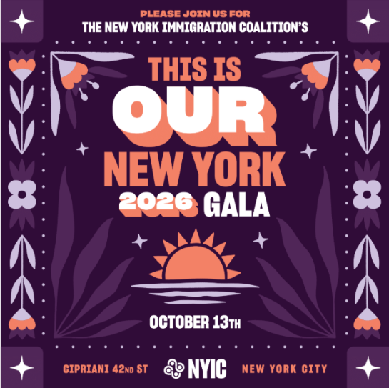
Folk-art florals in lilac and coral run down both edges like embroidery. In the center, a stacked headline where OUR is set biggest and offset in white against orange, over a rising sun on water.
The design is making a claim, not just an announcement. That's rare in this category and it works.
Takeaway: emphasis as meaning. Blowing up a single word in the headline turns a title into a statement — and tells a supporter what the night is about before they read the date.
9. Race to Erase MS — Love to Erase MS, 33rd Annual Gala
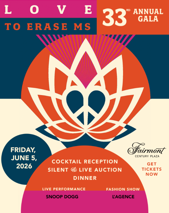
Mid-century color-blocking in pink, orange, navy, and cream, built around a geometric emblem that reads as lotus, peace sign, and heart at once. Circles and arcs slice the layout into zones — one for the date, one for the program, one for the venue.
The card also lists a live performance by Snoop Dogg and a fashion show by L'Agence, plus a direct "get tickets now."
Takeaway: the modular grid. Blocking information into shapes lets a busy card stay legible — and if you have a headline draw, the save the date is where you announce it.
10. Rebuild North Brooklyn — Fall Gala
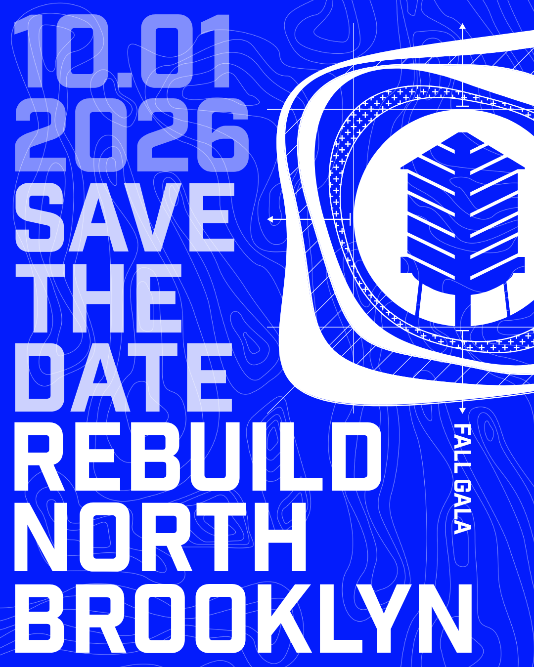
Electric blue, edge to edge. Topographic contour lines, technical dimension arrows, and a water tower rendered in flat white — the whole thing reads as a blueprint. The type is massive condensed uppercase, stacked in four tiers with the date ghosted back a shade so the org name lands last and loudest.
No gold. No serif. No apology.
Takeaway: commit to one idea completely. The blueprint metaphor matches the mission so tightly that the card needs nothing else — and in a feed full of navy-and-gold, it stops the scroll.
What the good ones have in common
Look across all ten and the pattern is clear. The strongest save the dates pick one idea and go all the way with it — a blueprint, an arch, a starburst, a single enormous word. The weakest ones hedge, adding a little of everything until nothing leads.
Second pattern: the design tells you what kind of night to expect. Nobody opens the Rebuild North Brooklyn card and dresses for black tie. Nobody sees the AIFS arch and expects folding chairs. That's the save the date doing its real job — setting expectations six months out, so the invitation has less work to do later.
And the last thing every one of these should do: point somewhere. On Gala Season, every event has a home — a page where supporters can discover the cause, champion it, and connect with your organization long before the doors open. Put the link on your save the date, and a beautiful reminder becomes an easy first yes.